TUL Sans Is More Than Just A Typeface; It's A Love Letter To Tulsa

VOKSEE partnered with the creator of the thoughtfully-designed “TUL Sans” typeface to create a one-of-a-kind tribute to our beloved HQ here in the Paris of Oklahoma. While he wants to remain anonymous, the designer is totally fine with the entire world seeing his work. Learn about the meaning behind every aspect of the bold and striking TUL Sans in our interview below.
Why did you create this typeface?
It's kind of a long story, but the idea was born out of a series of conversations that took place at the end of 2018 with some like-minded Tulsans who were looking for more ways to represent Tulsa and the various efforts taking place within it. We discussed a lot of things, but the bulk of my ideas were focused on identifying opportunities to visually connect the community and exploring ways to empower Tulsans to play a part in sharing Tulsa's story. Typography was one of the earliest things I thought and talked about, so after a healthy amount of research and exploration, I started entertaining the idea of creating a typeface built for Tulsa and Tulsans.
What was your inspiration?
Inspiration came from a lot of places. Historic and modern photographs, illustrations, murals and graffiti, landmarks, architecture, signage, uniforms, posters, movies, music, and so many other things. It's hard to put a number on all the things that guided and inspired me because the list was so expansive.
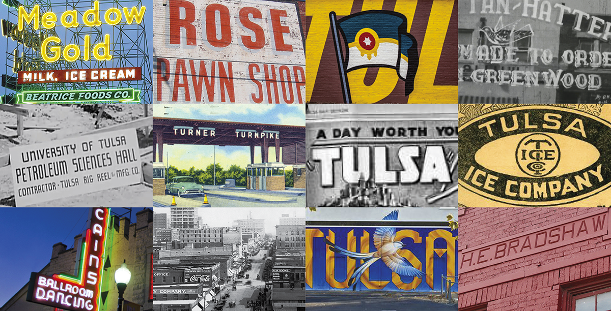
But from the beginning, I really wanted a better understanding of the role typography played in representing Tulsa. I wanted to see how the word was rendered and get a better feel for the typographic styles that were most commonly used in places or things that were distinct to the city. So as part of my research process, I put together a review of historic and modern typography in or around Tulsa. From that, I was able to identify some common characteristics, key traits, and prime examples. There was a heavy presence of bold, sans-serif fonts; letterforms were largely geometric and condensed; and subtle Art Deco influences were also pretty common.
With those things in mind, I hoped I'd be able to find an existing typeface to use as part of the broader efforts I mentioned earlier, but that proved to be a difficult task. I kept running into the same obstacles over and over. Letterforms would hit on some, but not all of the characteristics and traits; accessibility and wide-spread use would be an issue due to licensing costs and/or requirements; multilingual capability would be limited or non-existent; and ownability would be difficult to achieve because many typefaces were prominently featured in campaigns and materials for other places or things. As a result, and perhaps against my better judgment since I'd never done it before, I decided to explore creating a custom typeface which would be guided in large part by findings and prime examples from the typography review.

What's in the name?
When it comes to names, I explored a lot of different things and honestly I struggled a bit with what to call it. The one thing I knew from the beginning was that it had to be tied to Tulsa in some way. The connection could be obvious or discreet, but it had to be there.
I thought I had settled on a name a couple of times, but in the end I kept coming back to one of the first options I came up with, which was TUL Sans. (Pronounced T-U-L Sans) You can boil the name down to a few things:
1. TUL is the airport code for Tulsa and is something that is used pretty regularly by Tulsans and Tulsa businesses in marketing materials, merchandise, speech, etc. Also, because it is an airport code, "TUL" offered the opportunity to communicate a connection to Tulsa to audiences who are outside of the state, region, and country.
2. It's a sans-serif style typeface and using "sans" at the end of the name is a pretty common way to title typefaces and fonts. So, the "Sans" part is pretty self-explanatory.
3. When you combine the "TUL" airport code with the "Sans" descriptor, you end up spelling "Tulsans," which seemed a little too good to be true because that's who it was made for and who it represents. Admittedly, it's a little cheesy, but I couldn't ignore it. The likelihood of that combination happening anywhere else seemed really small, so I felt it was kismet.
4. Lastly, there are currently two variations of the typeface. The primary version, TUL Sans, is an all caps geometric, condensed sans-serif. Then you have TUL Sans Deco, which is largely the same as TUL Sans, but it has modified letterforms that pay homage to the almost unmatched wealth of Art Deco architecture and design found in Tulsa. So, it's kind of a bonus offering that delivers a little extra taste of Tulsa.

What do you want people to see/feel when they see this typeface?
That's a good question. This is my first attempt at creating a typeface, so it's hard to say. I guess I hope that people recognize something in it that feels familiar or authentic to their experience with Tulsa. In the end, that's a big part of the overall goal — to give Tulsa and Tulsans something that they can relate to, feel good about, and want to use when they talk about the place they call home.